It's in the details....
I know....brown and green AGAIN! Sometimes I just get hooked on a color combination, and just run with it. I do love the way these two colors work together. I blame it on the flowers I found, green with touches of brown. I saw them and thought they were interesting, then immediately challenged myself to make some cards/pages using them....hence the onslaught of this color themed projects.
Now, on to the card. This is the finished card.....
Here are the details broken down (click on images to see them larger).....
Distressing - I guess if I have a "signature" technique that I use on almost all of my cards and pages, it would be distressing. It really takes any card or page from ordinary to extraordinary in one simple step. Notice the green around the image area, and the brown around the outside of the card. This is one form of distressing, and the simplest to achieve. I use pieces of cut up Cut n' Dry foam pad (you can use pieces of sponge as well). Simply dab the pad or sponge onto the stamp pad, picking up plenty of color. Then run the pad or sponge along the outside of the area you want distressed. You can control the amount of "distressing" that occurs by how you hold the pad or sponge. Tilting it inward gives more color, while holding it perpendicular and running it just along the edge gives a more crisp edge with just a hint of color.
 Background stamping -
 Notice the background on the tan part of this card. It is not decorative paper...I stamped it using two different stamps. The secret to keeping the background unobtrusive is to "stamp off" before stamping on your card. Here's how: I inked the triangle background stamp with green ink, then I stamped it onto scrap paper lightly, then did it
again, very lightly the second time. There was just enough ink on the stamp for my background. I huffed on the stamp and stamped my background. Huffing, or breathing directly onto the stamp, reactivates the ink, which is important when there is so little left on the stamp. Next, I did the same thing with the word background stamp. I had to repeat these steps, as neither stamp was large enough to cover the entire card.
Layering - Layering is probably the single most important thing you can do to raise the interest of your card. Layering helps separate and highlight the main elements or images. Also, layering introduces color and helps balance your composition. I layered brown under the main image to help the eye focus in on the object (flower). The green panel behind, and just up and to the left, is to bring some green into that part of the composition, and to balance the elements that I knew I would be adding to the bottom right.
 Corner Interest -
 When I have my pieces ready to assemble, I "play" with them, and begin to create my composition, laying out the pieces, moving them around, trying different things with them. During this process, sometimes I feel there is something not quite right. In this card, for instance, something was bothering me. The image is soft and elegant, so I wanted to emphasize this in the finished card. That's when I realized it was all the right angles. I simply punched the corners of the main piece and border, and voila!, instant elegance! Of course, I re-distressed the edges after I punched the corners.
Borders - Borders add a nice surprise element to any project, and are easy to achieve. A border can be stamped on, drawn by hand, or it can be a strip or more of patterned paper. In this case, I chose to use an embossing template. I ran the main card through my Cuttlebug with the border template at the bottom (you can do this with a template and a light box if you do not own a die cut/embossing machine. Again, keeping with my theme of details, notice the green on the raised branches. I simply ran my green inked Cut n' Dry pad along the border, lightly, so that the color stayed on just the raised areas of the embossing.
Embellishments - I must say, I am a true embellishment addict!! This is probably another of my "signature" techniques. I use flowers, ribbons, charms, brads, eyelets, tags, anything that will add a touch of interest to and enhance my project. Sometimes the embellishment is an afterthought, something I add after the main parts of the card are assembled. In this case, as you read above, the main element, the flowers, inspired the card, and I created the card because I was inspired by the element.

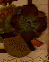
While I'm on the embellishment area of this card, I'd like to point out that I didn't simply plop a single flower down in the corner. I layered two flowers together, and secured them with a coordinating brad. This is where I ran into a problem, as I had no brown brads, and my green ones were the wrong shade. I "colored" my plain gold brad by sanding it slightly to help it hold ink, then I put the brad into a tweezer and dabbed it into a VersaMark clear ink pad, then dipped it into copper embossing powder, and heated it. While it was still hot, I re-dipped it into the powder to give it a second layer of embossing. Voila! - a copper brad.

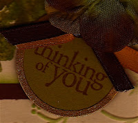
Notice, also, the tag and ribbon directly under the flower. The tag gave me a vehicle for my phrase, and helped create an embellishment "grouping," rather than just a single embellishment. If you notice tabletops and shelving in decorator magazines, there are groupings of interesting elements, rather than just a single item. I follow this same idea in my card and page compositions.
I used my Cuttlebug to create the round "metal rimmed" tag. All of my metal rimmed tags were white, with silver rims, so I simply made my own. The rim was a scrap piece of ancient gold shimmer paper, which was just what I needed. I ran the tag die through my machine twice; once on green paper for the center, then on gold shimmer paper for the rim. My sentiment fit perfectly on the tag, and was easy to place with Hero's clear stamps! Finally, I tied two pieces of coordinating ribbon into a knot and adhered them to the tag top with glue dots.
Finally, a word about Color - Never underestimate the power of color. I am often told that I have a natural "color sense." Well, maybe so, but I believe anyone can learn how to mix, match, and coordinate color. It is an art which can be developed. Browse through current magazines, look at fashions in clothing, furniture, accessories. Look at the outfits in your closet. Challenge yourself to try new color combinations you see there, which you may never have thought to combine. The guidelines are simple....ask yourself, "does this appeal to me?" If so then go with it.
For me, this week it's brown and green, next week, who knows. I did just see a lovely orchid, cream, and green afghan I just love. Hmmmm....I think I see a layout coming!
Thanks for visiting! Leave some love if you're so inclined. Come back soon!
Blessings,
lynda


